
“Our banner ads are not getting clicks!”
That's a statement we're quite familiar with. We have uttered it many times after our campaigns failed, and we have also heard it from some of our clients who've advertised on our properties. Do banner ads work at all? That's the question we decided to find an answer to. Thus began our research programme in July 2018. Soon, we discovered that they did work. We also discovered that there could be a variation of 100 times (or higher) between a good banner ad and a not-so-good one when published on the same website, at the same location!
What's the difference between the banners that work and those that don't? How can we make sure our banner ads work better than others?
We started following the Web gurus, and started collecting samples of award-winning Web banner designs. Plus, we started experimenting with banner ads created for our own properties and our clients. Our aim was to find the 'secret' recipe that would make banner ads successful, and then use it for our clients and ourselves.
But then, someone in the team reminded us of our commitment towards 'open source' and our belief in 'you get what you share'. That led to a voting session. I tried to explain to them that free advice is not valued, but I lost the vote, and as a result, we are sharing these 'secrets' with you...

#1. A creative cannot correct a marketing mistake
When we started searching on tips, and dos and don’ts with respect to Web banner advertising, we realised that a lot of advice was for the creative folks--those who design the banner ads. That's good advice--but we knew something was amiss. A few experiments later, we realised that if the creative team is provided grass to work with, it can't bake a black forest cake--however creative the team may be.
Hence, we decided to focus on the marketers through this piece, and list the guidelines for the creative team at the end, so that marketers know what to expect from them.

#2. If it doesn't catch attention--it's a flop
It's obvious isn't it? If users don't notice your Web banner while browsing a website, what are the chances they will click on it? Think. Think again. Once this point sinks in, the rest of what I have to share will become easy to follow. And, this is NOT just a 'banner design' issue.

#3. Tempt or Tease
This was to come in much later, but I realised that so many of us get this bit wrong (about Web banners) that I decided to promote it up the order.
Let me use an analogy to explain this point. A typical print ad would have a catchy title copy followed by body-text that explains the idea in detail. In the case of Web banners, the ads should be used only to 'Tempt and Tease' and the explanatory text or details should be provided in the landing page.
Many of us make the mistake (we do too)--we try and push as much content as possible in the banner ads. Result--so much text, and nothing stands out.
My advice--either 'tempt' or 'tease' users so that they end up clicking your banner ads. (But, do NOT mislead in the guise of tempting--else your bounce rate will be high, and your brand will take a beating too!)

#4. Web banner = Web banner + Landing page
We could not come across a single worthwhile campaign where the Web banner achieved its goal without an equally good (or even better than the banner) landing page.
Never think about the Web Banner in isolation. First, review the landing page, and then design the Web banner keeping the landing page in mind. What follows will further build upon this point.

#5. Clearly define the goal
The gurus will tell you that this advice is applicable to everything you do in life and not just marketing, but when it comes to Web banners, this implies having good answers to the following questions:
1. What do you want out of your campaign?
2. Who's your target audience?
3. Does your landing page help to achieve that goal?
4. Last, but not the least, has your Web banner been designed to connect with your target audience, and does it have the right element of 'tempt' or 'tease' for them to click?
BONUS: For multiple goals, create multiple creatives. Don't try to achieve all goals through a single creative.

#6. Right message for the right website (aka audience)
Have you selected the right website for your campaign? I often come across marketers who want to reach out to senior business decision makers but end up advertising on our flagship website (www.electronicsforu.com) rather than where the business decision makers flock (www.electronicsb2b.com). I ask them why? Their reply: We want to be on the leading websites -- that's where the numbers are.
To me that sounds like trying to promote a Louis Vitton in a mall that's a popular supermarket! Thankfully, the LV team does not try being as brave as some of these marketers.
While going for the leading websites is not at all a bad strategy (DISCLAIMER: I am biased on this aspect, because we have many of them in their respective categories) but do remember these should be leaders with respect to your target audience too.

#7. What's in it for them?
This point is related to the earlier one on 'tempt' and 'tease'. Who you are, what you do, how many awards have you won—all of that doesn’t really matter to your customers, most of the time.
What can you help them achieve is what matters to them. That's what you should be sharing with your creative team, and then expect them to serve you a black forest cake.

#8. Location, location and location
If your banner is located where no one notices it, then all's lost (as per rule #1). This aspect is pretty similar to real estate--it's all about the location. Review the average page impressions of the location, and make sure these are high visibility locations. Besides those on the first-fold, banner ads that come within the flow of the content attract good engagements too.
#9. Do not disturb
The idea of banner ads that users can't help but notice seems akin to Rule #1. But if these ads end up 'interfering' with their work, they will treat your creative just like they would treat a fly buzzing over their head while they are working on something important--shoo it away!

#10. Do not trick
Some publishers love to sell options where it's difficult for the users to differentiate between the banner ads and the content of the website. And that generates a lot of clicks. Win-win for both--publishers and advertisers--is what they pitch this scam as. But, most times, what you get here is a frustrated audience that’s exclaiming "WTF!!!" since your landing page is loading along with your revered logo. You’ll get the clicks. The goal, however, may elude you.

#11. Sense of urgency
This ingredient makes every type of marketing communication more successful. Given our human nature, we tend to react when there's urgency. So, if there's an element of urgency make sure to share it with your creative team, so that they can enhance the 'tempt' element of the Web banner.

#12. Creatives that work
Has your creative team created banner ads that have a higher chance of succeeding? To help you figure that out, here are the best practices and guidelines shared by the gurus of the industry..
DESIGN GUIDELINES

#13. Animation works better than stills
Banner ads with animation (slight movements) are great at catching the eye. In fact, at times, these slight movements work better than fully animated videos, as the user is left wondering: "What just moved on the screen?"

#14. Creative CTA
There are only two things your users can do with your Web banner after viewing it--click on it or not.
But, that click can be for a variety of different reasons which you may want to communicate rather than the plain old ‘Click Here'. It could be 'Download', 'Learn More', 'Call Us', 'Register' or even 'Discover Our Secret'. Try and replace Click here with better CTAs, where-ever possible.
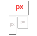
#15. Ad sizes
Google has shared 'common' banner ad sizes that work. While creativity and 'common' don't often go hand in hand, make sure your banner ads are available in these sizes too--else you may find that you have creatives that no website can display!
These sizes are: 728 X 90 pixels (Leader Board), 300 X 600 pixels (Half Page), 300 X 250 pixels (Medium Rectangle) and 336 X 280 pixels (Large Rectangle).
Also, avoid banner ads that have sizes smaller than what Google has advised. (Aside: This forced us to reduce the number of banner ads being displayed on our websites, as we had to stop selling the smaller banner ads)

#16. Colours
Every colour has a different association, and it’s important to consider what types of emotions you want to evoke in your audience. Colour will be one of the first things a user notices in your banner ad. Colours are also subjective and have different associations in different cultures. Make sure to study your target audience when making your colour selections.

#17. File size
The smaller the better. Google suggests under 150 kb. If your ad does not load fast enough, users will scroll ahead and miss it.

#18. File format
Stick to JPG, PNG, GIF or HTML5 files. Avoid Flash.

#19. Good images
Avoid poor quality images. Choose relevant graphics and photos that enhance your message and are directly related to your product.

#20. Fonts
Make your headline and body copy in different sizes. All copy should be in four lines or less. Don't use cursive/script fonts, extremely thin font weight, all uppercase copy, or font sizes smaller than a 10 pt (unless it’s a disclaimer or copyright notice).
#21. White space
Leave as much breathing space as possible. This will enable your messaging and your banner ad to stand out, and be noticed.

#22. The lesser the better
Leave as much breathing space as possible. This will enable your messaging and your banner ad to stand out, and be noticed.
Do banner ads work at all? That’s the question we decided to find an answer to. Thus began our research. Soon, we discovered that they did work. We also discovered that there could be a variation of 100 times (or higher) between a good banner ad and a not-so-good one…
I want to explore
marketing ideas to grow
my business...
For any query feel free to mail us at [email protected] or call us at
+91-98111-55335

